How to read a candlestick chart
The chart most traders use, explained from scratch. You will learn what each candle shows, how to read a whole chart step by step, and which mistakes to avoid. No experience needed.
What one candle shows
A candlestick packs four prices from one period into a single shape. The period can be a minute, a day, a week or a month. The four prices are always the same:
- Open: the price when the period started.
- Close: the price when the period ended.
- High: the highest price reached.
- Low: the lowest price reached.
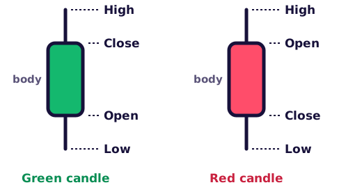
The thick part is the body. It runs from the open to the close. The thin lines are the wicks, also called shadows. They reach up to the high and down to the low.
A line chart joins only the closing prices. A candlestick chart shows all four, so you can see how far price moved during the period and which side ended up in control. Until a period ends, its last candle keeps changing: its "close" is simply the latest price.
What green and red candles mean
The colour tells you who won the period. A green candle closed higher than it opened, so buyers won. A red candle closed lower than it opened, so sellers won. Some charts use white and black instead. The meaning does not change.
Look at the size of the body as well. A tall body means one side won clearly. A tiny body means price ended about where it started.
What wicks tell you
A wick shows where price went but could not stay. A long upper wick means buyers pushed price up and sellers pushed it back down before the close. A long lower wick is the opposite: sellers pushed price down and buyers stepped in.
Say a daily gold candle opens at $4,300, drops to $4,220 during the day and closes at $4,310. The body is small and green. The long lower wick tells you buyers refused the lower prices.

Read a wick as a rejected price. The market visited that level and did not stay there, at least for now.
How to read a candlestick chart, step by step
- Check what you are looking at. Read the market name and the timeframe first. Is each candle an hour, a day or a week?
- Find the trend. Zoom out. Are the highs and lows rising, falling or moving sideways?
- Look at the latest candles. Are the bodies growing or shrinking? Big bodies show conviction. Small ones show hesitation.
- Read the wicks at key prices. Long wicks near an old high or low show where buyers or sellers pushed back.
- Decide what would prove you wrong. Before you act on any chart, know the price at which you would get out.
Which timeframe to use
The same market looks very different depending on how much time each candle covers. On a 1-hour chart, one bad afternoon can look like a disaster. On a weekly chart, that afternoon disappears inside a single candle.
Beginners usually learn faster on daily or weekly charts. They move more slowly and filter out most of the noise. A good habit: start on the weekly chart, then zoom in to the daily one.
From candles to trends: three real charts
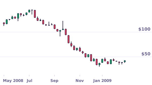
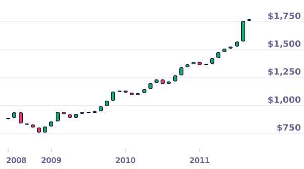
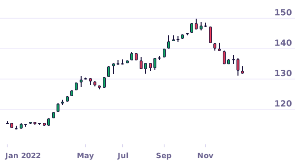
One candle describes one period. A row of candles shows where the market is heading. In an uptrend, each high beats the last one and each dip stops higher than the one before. In a downtrend, highs and lows keep getting lower. Three real examples:
Three patterns worth knowing
Traders give names to common candle shapes. A pattern describes what buyers and sellers did. It does not promise what happens next, so treat it as a hint that needs context. A pattern at a key level, in the direction of the trend, means more than the same shape in the middle of a range.

Doji
Open and close almost equal. Neither side won.

Hammer
Small body and a long lower wick after a fall. Buyers stepped in hard.

Engulfing
A big candle covers the whole body of the one before. The other side took over.
Beginner mistakes
- Reading one candle on its own. A single candle says little without the trend around it.
- Forgetting the timeframe. A "crash" on a 5-minute chart can be a tiny wiggle on the daily chart.
- Treating patterns as promises. A hammer can fail. Decide where you would get out before you act.
- Trading without a stop loss. Your exit plan matters more than your entry signal.
- Using leverage too early. With CFDs and other leveraged products, a small move against you can wipe out your deposit. Practise with pretend money first.
FAQ
What do green and red candles mean?
A green candle closed higher than it opened, so buyers won that period. A red candle closed lower than it opened, so sellers won. Some charts use white and black instead, and most apps let you change the colours.
What do the wicks on a candle mean?
The wicks are the thin lines above and below the body. They mark the highest and lowest prices of the period. A long wick means price reached that level but was pushed back before the close.
Which timeframe should a beginner use?
Daily or weekly charts. They move more slowly, filter out a lot of noise and give you time to think.
Are candlestick patterns reliable?
They show what buyers and sellers did, but no pattern works every time. Experienced traders combine them with the trend, support and resistance, and strict risk limits.
Who invented candlestick charts?
They come from Japan's rice markets. The 18th-century rice merchant Munehisa Homma is often credited with early versions. Steve Nison's 1991 book made them popular with Western traders.
Do I need money to practise?
No. You can practise on real historical charts for free in Chart School, or on a broker's demo account with pretend money.
Sources: Charts use real prices: US crude oil, weekly (US Energy Information Administration); US dollar against the Japanese yen, weekly (US Federal Reserve); gold, monthly averages (World Bank). Educational content, not financial advice.

Now try it on real charts
Ten quick questions on real charts: the close, the trend, the highs and the lows.
Play Chart SchoolKeep reading
 Support and resistance: trends, levels and breakoutsSupport and resistance for beginners: what they are, how to find levels, why they flip, how to tell breakouts from fakeouts and where to put a stop loss.Read the guide
 How to choose a safe, regulated brokerHow to check a broker's licence with the FCA, ASIC, CySEC, SEBI, OJK or another regulator, which protections cover your money, and the red flags of scams.Read the guide
 What is inflation? How it is measured and what it does to your moneyInflation for beginners: how the CPI basket works, central bank targets, why prices jumped in 2022, real returns and what inflation does to savings.Read the guide